Website & Branding
✦
AppsFlyer
Boosting user engagement with a new website design and branding
Problem Statement
Establishing a Cohesive Visual Identity: Transforming Marketing Through Design
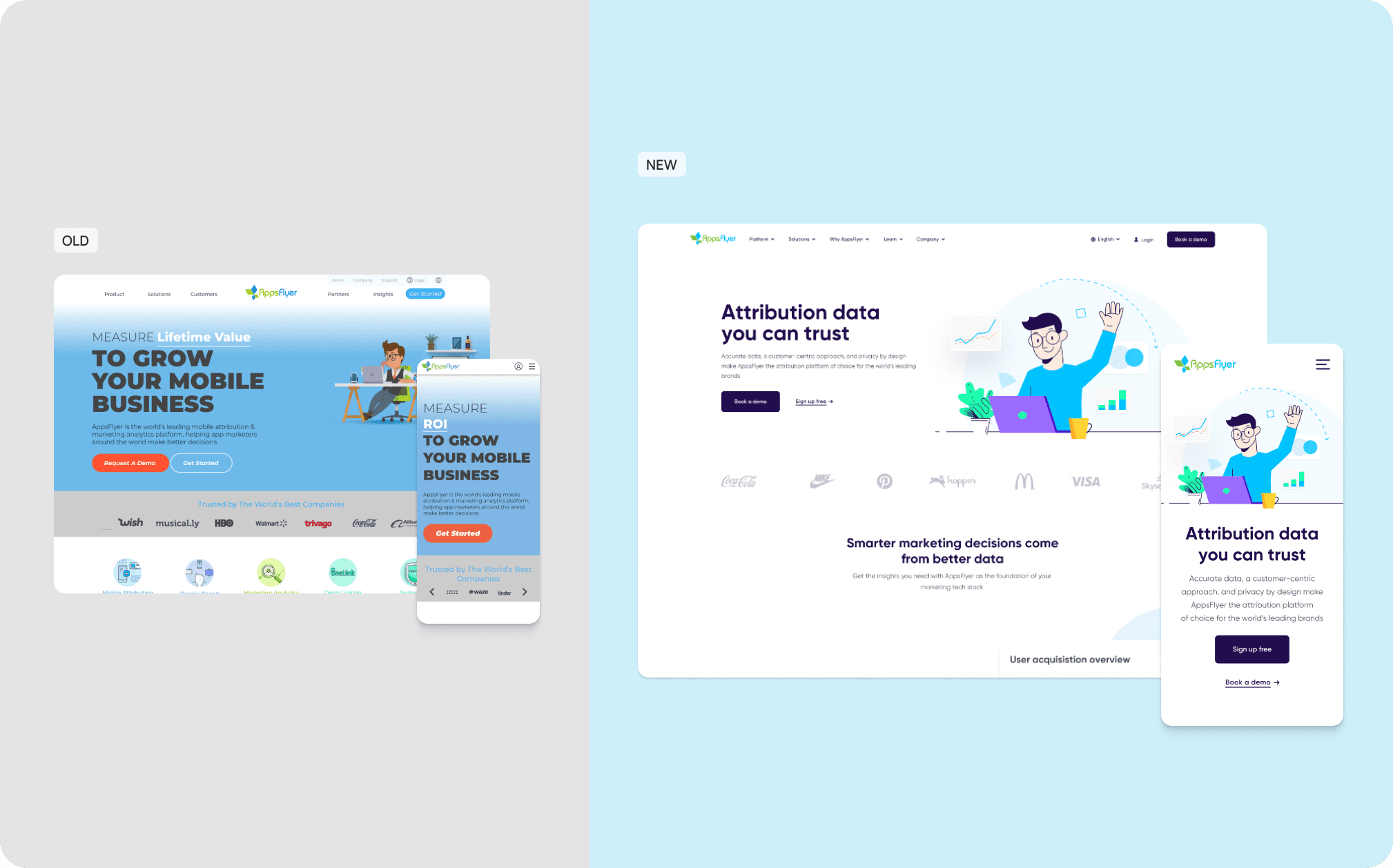
Joining AppsFlyer in 2019, my role was pivotal in generating visual materials for marketing initiatives. I rapidly identified a critical gap — the absence of a cohesive and recognizable visual identity — which was impeding the design team's workflow and overall marketing efficacy.


Goals
What were our key objectives for the website redesign?
Improve loading speeds by at least 50% to enhance user experience and reduce bounce rates.
🔺
Streamline user pathways and optimize calls-to-action to facilitate easier user actions and boost conversions.
🔺
Develop a new visual identity that reflects our mission, unifies marketing materials, and energizes the design team.
Challenges ⚔️
🔺
Develop a universally appealing visual style for a rapidly expanding SaaS startup, ensuring it resonates across diverse global markets and cultural landscapes.
🔺
Insure that the new design complies with international accessibility standards, making the website usable for people with various disabilities.
🔺
Create a scalable design system that can efficiently support the growing range of products and features without compromising on speed or user experience.
Research
Problem Discovery Phase
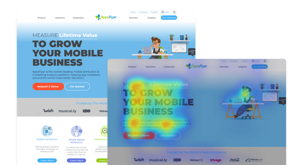
To understand the reasons behind low performance , my team and I conducted comprehensive research, including content audit, competitive analysis and website analytics review. This research approach enabled us to identify user pain points and understand their underlying causes, empowering us to develop strategies for improving the ZOLO website. Leveraging insights from competitor benchmarking, I then led my team to implement a website redesign that prioritized user experience and aimed to drive sign-ups.


How new website should looks?
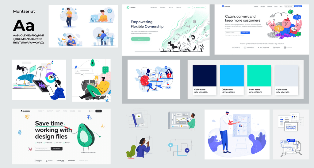
The design process involved creating mood boards and gathering inspiration that resonated with the brand's ethos and the users' preferences. This step was critical in setting a visual direction for the redesign.
How new website should looks?
The design process involved creating mood boards and gathering inspiration that resonated with the brand's ethos and the users' preferences. This step was critical in setting a visual direction for the redesign.
How new website should looks?
The design process involved creating mood boards and gathering inspiration that resonated with the brand's ethos and the users' preferences. This step was critical in setting a visual direction for the redesign.


Design proceess
Sitemap and Content Audit
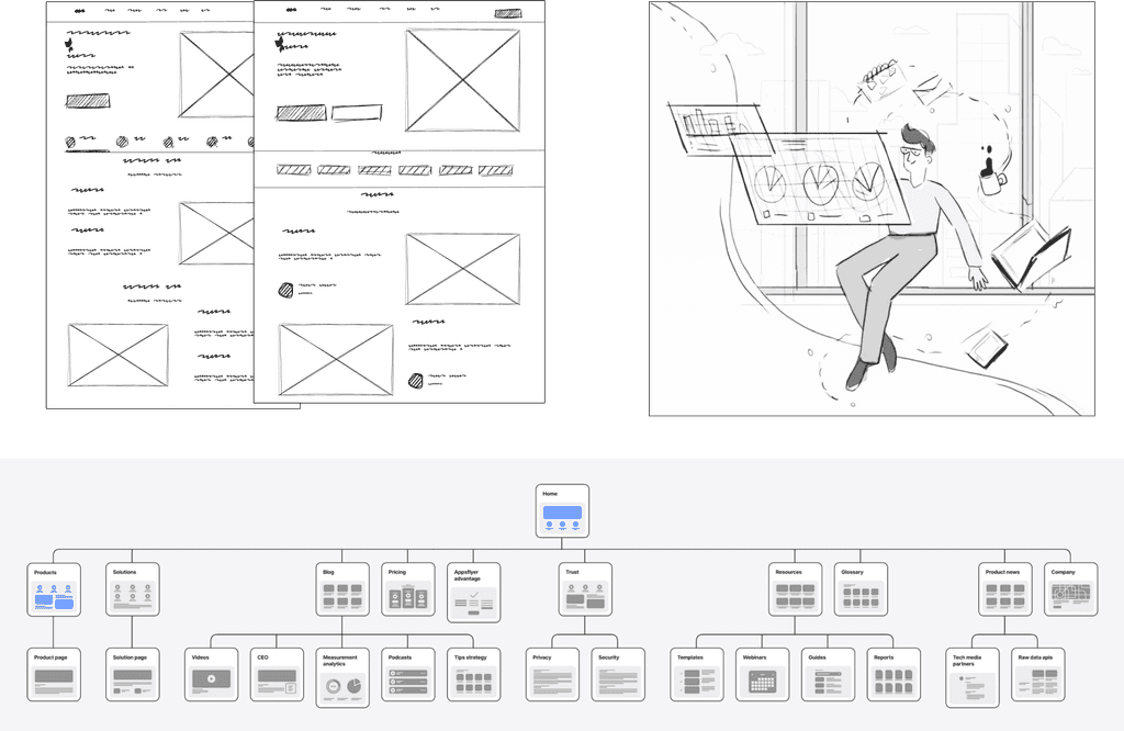
The redesign prioritized the most frequented pages, specifically the home page and the product overview page. These pages were crucial due to their high visibility and impact on user experience.Through detailed analysis, including feedback collection and needs assessment from product managers, a clear understanding of the target audience and key website functionalities was established. This informed the restructuring and redesign of the identified pages.


Design concept and feedback
We sketched high-fidelity wireframes to establish layout, and structure, and validate ideas with our stakeholders. A few screens went through multiple iterations until we found the best fit. Additionally, we developed interactive prototypes for complex screens/flows as and when required.
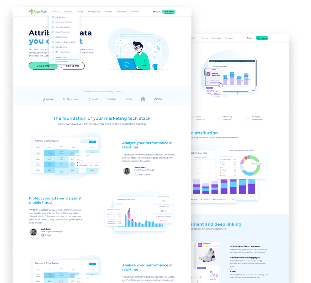


Improving UI and illustration
After feedback and meetings with stockholder we continue to improve the style and language. I was more focus on draw new illustration style and product interface present on website. This initiative ensured consistency across our platform, aligning every visual aspect with our newly established brand aesthetics.


New style
In a concerted effort, we developed a fresh visual language for our illustrations alongside the studio's designer, culminating in a style that garnered acclaim from both our stakeholders and users.
New style
In a concerted effort, we developed a fresh visual language for our illustrations alongside the studio's designer, culminating in a style that garnered acclaim from both our stakeholders and users.
New style
In a concerted effort, we developed a fresh visual language for our illustrations alongside the studio's designer, culminating in a style that garnered acclaim from both our stakeholders and users.


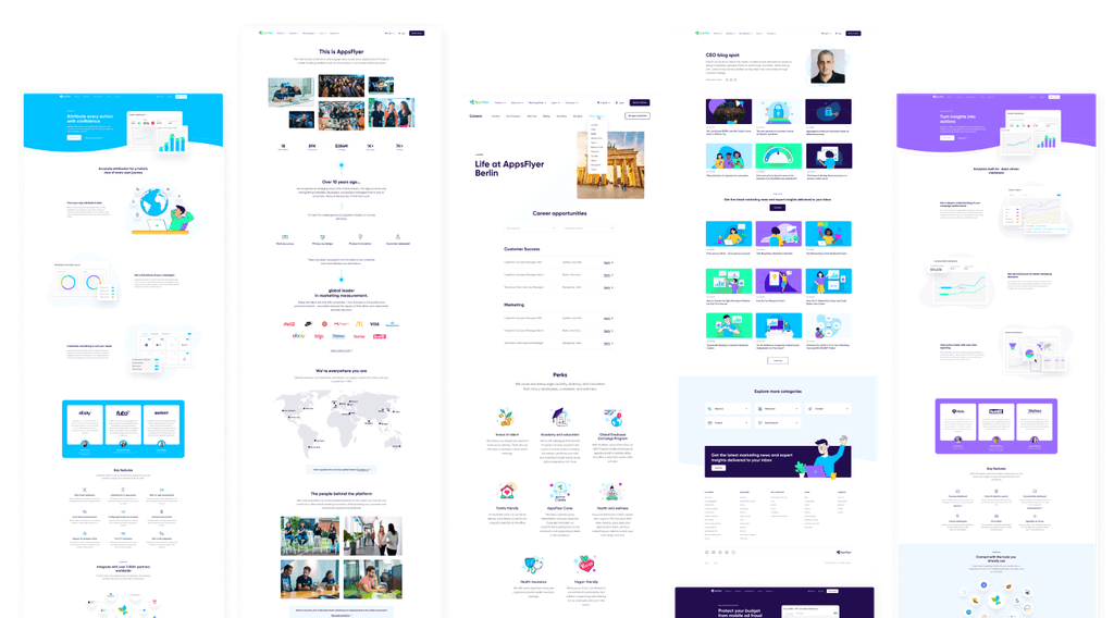
Final Design
Fresh and innovated
We are thrilled to unveil the culmination of our efforts in the final design for AppsFlyer’s website. The design boasts a modern and clean interface, with a color palette that reflects the brand’s innovative spirit.
Final Design
Fresh and innovated
We are thrilled to unveil the culmination of our efforts in the final design for AppsFlyer’s website. The design boasts a modern and clean interface, with a color palette that reflects the brand’s innovative spirit.
Final Design
Fresh and innovated
We are thrilled to unveil the culmination of our efforts in the final design for AppsFlyer’s website. The design boasts a modern and clean interface, with a color palette that reflects the brand’s innovative spirit.
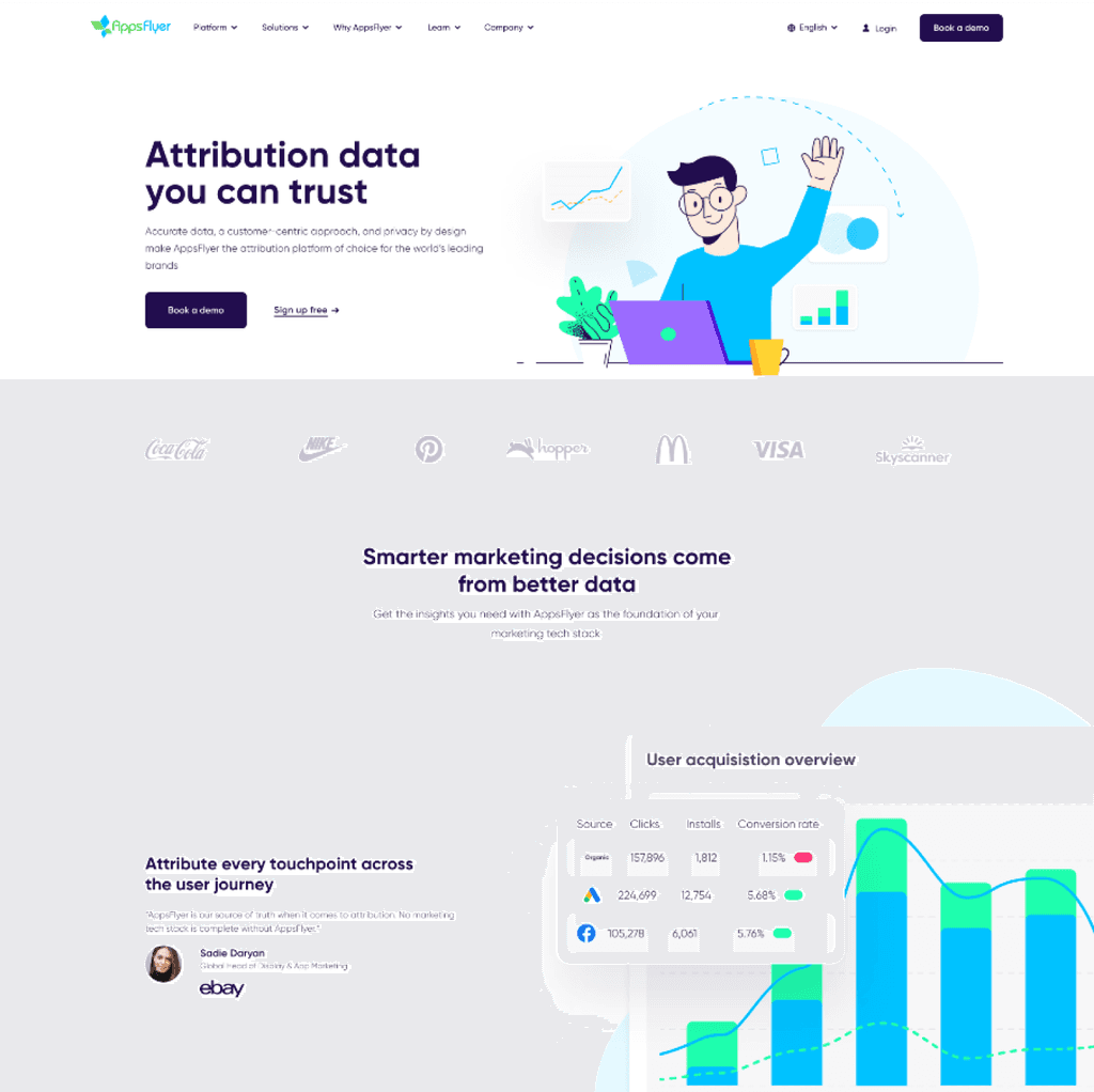


Home and information
Thoughtful typography and intuitive navigation were implemented to enhance readability and user flow, directly informed by our extensive user interaction studies. Each design element was meticulously crafted to not only echo the company's branding but also to facilitate a seamless user experience, resonating with the needs and preferences identified through our heatmap analysis.


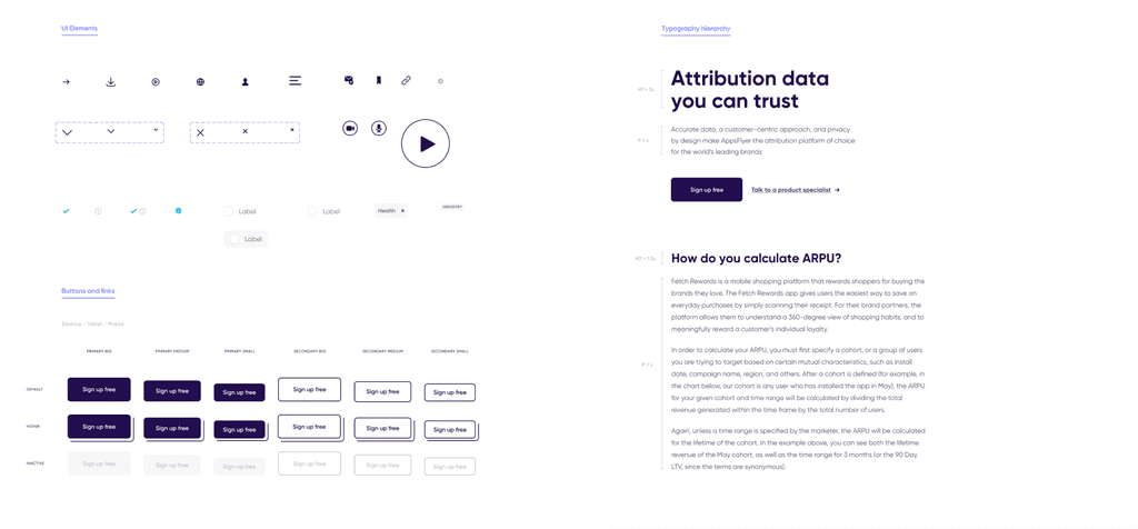
Disigne system components
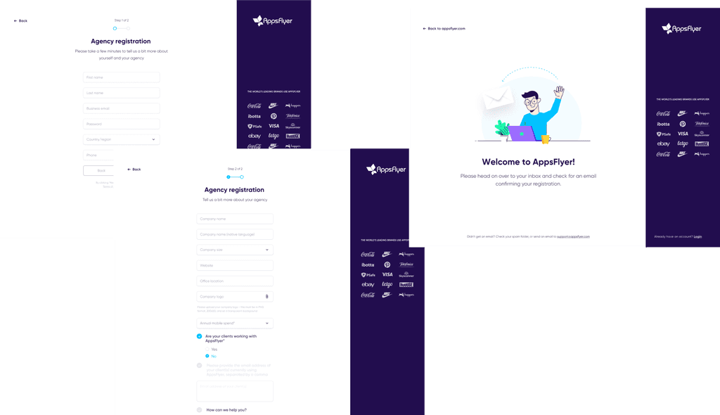
Moreover, I have created a part of design system with reusable components that ensures consistency throughout the app and enables quick changes and updates as needed. The design system includes components such as buttons, forms, and typography, and is easily accessible to the development team.


Figma Libraries & Illustration Builder
During the website redesign, I identified the need to improve our design workflow in terms of efficiency and consistency. To address this, I took the initiative to develop a new Figma library where AppsFlyer design team could find and use pre-designed elements with the ability to customize them, or easily create new ones. My main goal was to determine the look and feel of our dashboard illustrations for marketing use. To avoid delays caused by the parallel update of our AppsFlyer platform design, and to remain consistent with our new visual style, existing dashboards have been simplified and redesigned. I collaborated closely with my product design colleagues and received guidance from their expertise. Furthermore, I worked on organizing and simplifying all of the libraries that were created during the website redesign. This allowed the design team to create quality designs more efficiently, resulting in a 40% increase in output.


Conclusion
Disigne system components
I'm very proud of all the people involved in this challenging project and the work that has been done. The launch of the redesigned AppsFlyer website in 2021 marked a pivotal moment in the company's digital transformation journey. Accompanied by a comprehensive marketing campaign, the new website has been celebrated for its improved user experience, evidenced by positive user feedback and enhanced performance metrics like reduced bounce rates and longer session times. Notable improvements include faster loading speeds and a responsive design, significantly boosting user engagement and aligning the website's aesthetics with AppsFlyer's innovative brand image. Reflecting on the project, the team's collaborative effort and learnings from this large-scale redesign have been invaluable. You can view the live version by going to appsflyer.com

